A bar plot or bar chart is a graph that represents the category of data with rectangular bars with lengths and heights that is proportional to the values which they represent. The bar plots can be plotted horizontally or vertically. A bar chart describes the comparisons between the discrete categories. One of the axis of the plot represents the specific categories being compared, while the other axis represents the measured values corresponding to those categories.
Creating a bar plot
The matplotlib API in Python provides the bar() function which can be used in MATLAB style use or as an object-oriented API. The syntax of the bar() function to be used with the axes is as follows:-
plt.bar(x, height, width, bottom, align)
The function creates a bar plot bounded with a rectangle depending on the given parameters. Following is a simple example of the bar plot, which represents the number of students enrolled in different courses of an institute.
import numpy as np
data = {'C':20, 'C++':15, 'Java':30,
'Python':35}
courses = list(data.keys())
values = list(data.values())
fig = plt.figure(figsize = (10, 5))
plt.bar(courses, values, color ='maroon',
width = 0.4)
plt.xlabel("Courses offered")
plt.ylabel("No. of students enrolled")
plt.title("Students enrolled in different courses")
plt.show()
|
Output-
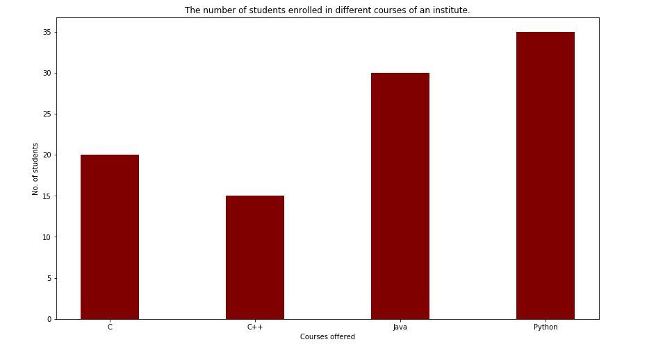
Here plt.bar(courses, values, color='maroon') is used to specify that the bar chart is to be plotted by using courses column as the X-axis, and the values as the Y-axis. The color attribute is used to set the color of the bars(maroon in this case).plt.xlabel("Courses offered") and plt.ylabel("students enrolled") are used to label the corresponding axes.plt.title() is used to make a title for the graph.plt.show() is used to show the graph as output using the previous commands.
Customizing the bar plot
import pandas as pd
from matplotlib import pyplot as plt
data = pd.read_csv(r"cars.csv")
data.head()
df = pd.DataFrame(data)
name = df['car'].head(12)
price = df['price'].head(12)
fig = plt.figure(figsize =(10, 7))
plt.bar(name[0:10], price[0:10])
plt.show()
Output-
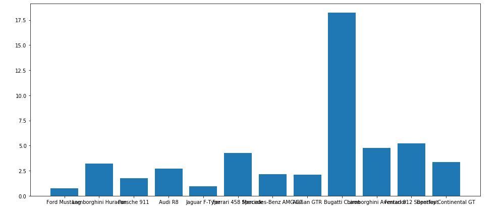
It is observed in the above bar graph that the X-axis ticks are overlapping each other thus it cannot be seen properly. Thus by rotating the X-axis ticks, it can be visible clearly. That is why customization in bar graphs is required.
import pandas as pd
from matplotlib import pyplot as plt
data = pd.read_csv(r"cars.csv")
data.head()
df = pd.DataFrame(data)
name = df['car'].head(12)
price = df['price'].head(12)
fig, ax = plt.subplots(figsize =(16, 9))
ax.barh(name, price)
for s in ['top', 'bottom', 'left', 'right']:
ax.spines[s].set_visible(False)
ax.xaxis.set_ticks_position('none')
ax.yaxis.set_ticks_position('none')
ax.xaxis.set_tick_params(pad = 5)
ax.yaxis.set_tick_params(pad = 10)
ax.grid(b = True, color ='grey',
linestyle ='-.', linewidth = 0.5,
alpha = 0.2)
ax.invert_yaxis()
for i in ax.patches:
plt.text(i.get_width()+0.2, i.get_y()+0.5,
str(round((i.get_width()), 2)),
fontsize = 10, fontweight ='bold',
color ='grey')
ax.set_title('Sports car and their price in crore',
loc ='left', )
fig.text(0.9, 0.15, 'Jeeteshgavande30', fontsize = 12,
color ='grey', ha ='right', va ='bottom',
alpha = 0.7)
plt.show()
Output-
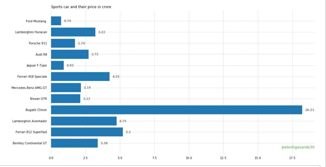 There are many more Customizations available for bar plots |


Comments
Post a Comment